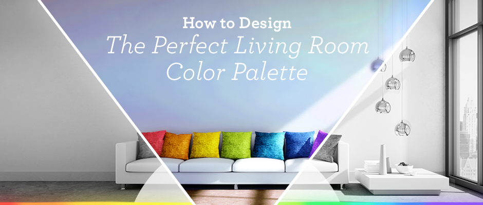
Have you ever walked into someone’s home or looked through pictures in a magazine and thought “wow, all those colors look great together.” Sure, you might know some of your favorite colors or what matches, but developing a color palette is key to cohesive design.
Luckily, developing a living room color palette isn’t as hard as it sounds. By understanding some of the basics about color psychology, color theory, and knowing how to look at a color wheel, you can develop a color palette that’s perfect for your home.
Let’s look at what you need to know when designing the perfect color palette and how to do it.

Basic Color Psychology
Before you get started designing your living room color palette, you should understand the basics of color psychology, or how different colors make you feel. Here are some common feelings associated with certain colors:
– Red – Red is exciting, energizing, aggressive, and passionate
– Orange – Orange is fun, happy, energetic, warm, and enthusiastic
– Yellow – Yellow is cheery, optimistic, fun, and happy
– Green – Green is refreshing, healing, and evokes feelings of generosity, hope, and success
– Blue – Blue is healing, tranquil, peaceful, and calming
– Purple – Purple is mysterious, enlightening, and luxurious
You can use these color emotions to decide how to decorate each room. For example, if you want your living room color palette to be calming and inviting, choose blue hues. If you want it to feel bright and cheery, oranges and yellows will do the trick.
Understanding Color Theory
Color theory is at the core of all interior design trends and you don’t need to be a professional to understand the basics. Let’s break it down:
– The color wheel consists of primary colors, secondary colors, and tertiary colors.
– The primary colors are red, yellow, and blue.
– The secondary colors are colors created when primary colors are mixed, including green (yellow and blue), orange (red and yellow), and purple (blue and red).
– The tertiary colors are colors made from primary and secondary colors, such as red-violet or blue-green. There are six on the color wheel.
– The color wheel is divided into warm colors (reds, oranges, and yellows) and cool colors (blues, greens, and purples)
Using the colors on the color wheel, you can make different hues, shades, tints, and tones.
– Hues are pure colors
– Shades are colors plus black
– Tints are colors plus white
– Tones are colors plus grey
Choosing a Color Scheme for Your Living Room Color Palette
Once you understand the color wheel and how it’s organized, you can start to understand the different color schemes available. Some of the most common color schemes are:
– Monochromatic – Variations in lightness and saturation of a single color
– Analogous – Using colors that are next to each other on the color wheel. One color will dominate, one color will support, and one color will accent
– Complementary – Using colors that are opposite of each other on the color wheel
– Triadic – Using three colors that are evenly spaced around the color wheel so that if you were to draw a line between the colors, it would make a triangle
– Square – Using four colors that are evenly spaced on the color wheel so that if you were to draw a line between the colors, it would make a square
Once you know which colors you want to use, complete your living room color palette with neutrals (black, white, grey, brown, tan, off-white, etc) to finish the look. Browns, tans, and off-whites make a color scheme warmer and blacks, whites, and grays can either be warm or cool, depending on the colors they’re paired with.
How to Create a Living Room Color Palette
So what does all this talk about color wheels have to do with your home? Once you understand the basics of color theory, you can make your own living room color palette to create a cohesive, beautiful style.
Here are the steps to get you started:
- Choose a base color, such as blue.
- Combine shades, tones, and tints to create either a monochromatic, analogous, complementary, triadic, or square color theme. For example, if you like the look of analogous color schemes, you’ll combine colors next to blue on the color wheel, such as greens or purples.
- Choose a complementary hue as an accent color. For example, if your base color is blue, the complementary color is orange.
- Add neutrals to either warm up or cool down your living room color palette. If your color scheme is analogous blues, brown, tan, or off-white will make it more warm and white, black, and grey will make it cooler.
Once you have your living room color palette, you can shop for interior design styles that match. You could choose a neutral tan or brown sofa, add some framed artwork that has your favorite shades and tints of blue, and experiment with subtle pops of orange to tie everything together.
Tools to Help You Create a Living Room Color Palette
Understanding the color wheel and color theory takes time and practice and these are just a few tips to get you started. If you’d like to learn more about color palettes and create your own living room color palette, check out these sites:
– Paletton
– Coolors
If you’re looking for more interior design inspo, check out these bloggers, too! With a little bit of guidance, practice, and basic color theory understanding, you can make your living room look like something straight out of a magazine.


